
Blog Post < Previous | Next >

G. Lion
Federal transfers favor many Trump-supporting states — but the correlation isn’t strong
Abstract
This article examines the relationship between net federal fiscal flows — how much each U.S. state receives from or pays to the federal government — and support for Donald Trump in recent presidential elections. The hypothesis: states that are net recipients of federal funding are more likely to vote for Trump, raising a provocative question about whether these states are voting against their economic self-interest.
Using data from the SUNY Rockefeller Institute, the analysis compares federal flows with Trump vote share across all 50 states over the 2016, 2020, and 2024 elections. The findings show a strong positive correlation when looking at a small set of large states — California and New York (net contributors) versus Texas and Florida (net recipients). However, when extended to all states, the relationship weakens significantly. Correlations drop, and explanatory power — measured by R² — falls below meaningful thresholds.
A secondary analysis measuring net federal flows as a percentage of GDP per capita yields similar results: the correlation holds among large states but is much weaker nationwide.
The data suggest that while there is some connection between fiscal dependence and support for Trump, it is far from determinative. Cultural identity, partisan loyalty, and ideological alignment probably play a stronger role than raw economic benefit. Yet the paradox remains: many of Trump’s most loyal voting blocs reside in states heavily dependent on the very federal spending his policy agenda often seeks to curtail.
This study highlights the limited role that direct economic benefit plays in shaping political preferences, offering a sobering reminder that voters often prioritize identity over pocketbook considerations.
Hypothesis
States that receive more in federal funding than they contribute — the net beneficiaries — are more likely to support Donald Trump.
This raises an ironic and provocative question: Are many Red States voting against their own economic interests? Trump’s brand of politics — marked by tax cuts that disproportionately benefit the wealthy and proposed cuts to safety-net programs — arguably undermines the very federal support that many of his strongest state-level supporters rely on. In this context, the alignment between fiscal dependence and political allegiance appears counterintuitive, if not self-defeating.
Federal Flows can have critical political implications
Examining net fiscal transfers, or Net Federal Flows, is essential, as these imbalances can have profound political and economic implications within federations or unions of states.
In Canada, for example, the province of Alberta has long contributed significantly more to the federal government in taxes than it receives in federal spending. In contrast, Quebec consistently receives more in federal transfers than it contributes. This persistent fiscal imbalance has fueled resentment among many Albertans, who view themselves as subsidizing Quebec’s public services and social programs. This tension has occasionally spurred calls for greater provincial autonomy or even separation.
A parallel situation exists within the European Union. Northern member states — such as Germany and the Netherlands — are net contributors to the EU budget, while southern countries like Greece, Italy, and Spain tend to be net recipients. These fiscal asymmetries have generated ongoing friction between northern and southern members, complicating efforts to deepen European integration. As a result, the EU’s financial architecture remains fragmented, particularly in areas such as capital markets and banking regulation — unlike in the United States, where such systems are more unified under a single federal authority.
In contrast, the United States has largely avoided this kind of “fiscal transfer malaise.” The key reason appears to be the opacity of intergovernmental fiscal flows. The net balance of payments between individual U.S. states and the federal government is rarely publicized, discussed, or even understood by the broader public or financial media. As a result, these flows have not become politically salient in the way they have in Canada or the EU.
However, this informational gap is beginning to narrow. The SUNY Rockefeller Institute of Government has compiled detailed data on net federal flows by state for the period 2015 to 2022. This analysis draws heavily from their findings to study the relationship between the mentioned Net Federal Flows and the % voting for Trump during the relevant 3 Presidential Elections.
Defining Net Federal Flows
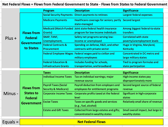
Let’s look at the flow of dollars between the States and the Federal Government. We will focus on the net difference between the two.
Net Federal Flows = Flows from the Federal Government to States — Flows from States to Federal Government
The Federal Government pays the States mainly through social entitlement programs including Social Security, Medicare, and Medicaid and unemployment compensation program.
The States pays the Federal Government through various Federal taxes including: individual, corporate, and payroll taxes.
Let’s say a State receives $1,000 from the Federal Government related to Social Security, Medicare, Medicaid, and unemployment programs. And, in turn this same State pays $900 to the Federal Government through various Federal taxes. In this case, this State would have a net Federal flow of $100. It would have received from the Federal Government $100 more than it paid. The table below describes these flows in more detail.
Defining our analysis
Once we have mapped out the Net Federal Flows at the State level, we will compare them to the % who voted for Trump at the State level during the past 3 Presidential elections. And, we will study the relationship between the Net Federal Flows and % voting for Trump. Our hypothesis suggests there is a strong positive relationship between the two. We will measure this relationship strength using correlation, and R Square.
We will run our relationship analysis twice:
- The first time using Net Federal Flows per capita
- The second time using Net Federal Flows as a % of GDP per capita
Analysis of Net Federal Flows per capita vs Trump %
Let’s first focus on the 4 largest States with two Blue States, California and New York on the left and two Red States, Florida and Texas on the right.
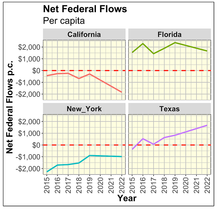
As shown above, the two large Blue States pay typically between $1,000 to $2,000 more to the Federal Government than they receive. Meanwhile, the opposite is true for the Red States. If we focus on just these 4 States there is a very strong relationship between Federal support of a given State (or positive Net Federal Flows) and % voting for Trump. We quantify this within the table below.
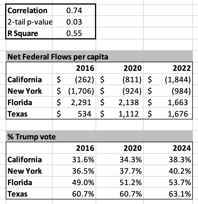
The above table denotes a very strong positive relationship between Fed support (Net Fund Flows) and % voting for Trump. A positive correlation of 0.74 that is statistically very significant (2-tail p-value 0.03) is very high. The related R Square of 0.55 suggests that Net Fund Flows explain 55% of the % voting for Trump at the State level. That’s a lot.
Next, let’s measure how strong this relationship is when including all 50 States. Let’s see how these Net Federal Flows match up with Trump vote %.
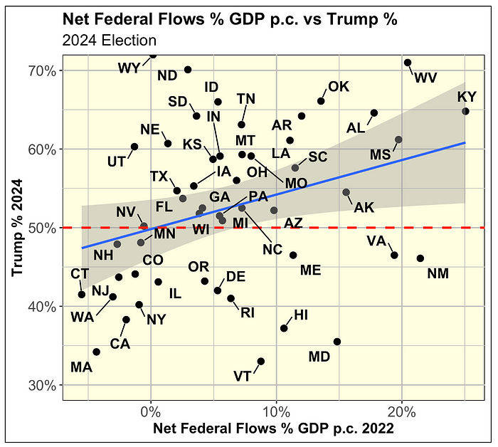
Let’s give a close look at the 2024 Presidential election. The scatter plot shows the Net Federal Flows per capita in 2022 (most recent data available from the Rockfeller Institute) with the % who voted for Trump in 2024.
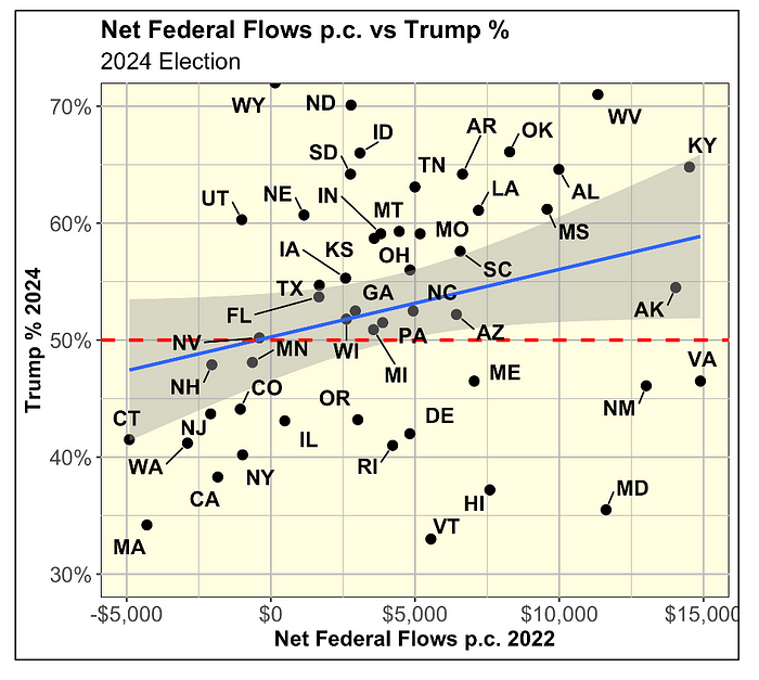
Within the scatter plot above:
- the blue line is the linear regression trend line that best fit the data.
- the gray zone is the 95% Confidence Interval (not to be confused with a 95% Prediction Interval). This Confidence Interval captures the uncertainty around the blue regression trend line. It means that we are 95% confident that the regression trend line would remain within this gray zone. You can imagine a pivot-center focused on either WI or GA. And, you could pivot the regression trend line up or down around that pivot-point.
- the horizontal dashed red line shows the Trump 50% level. All the States at or above that level are States that Trump won for sure. Notice that in this case there are many more States at or above the 50% level than below.
Overall, the scatter plot visually denotes a relationship between the two variables that is a lot weaker than when we focused only on the 4 big States.
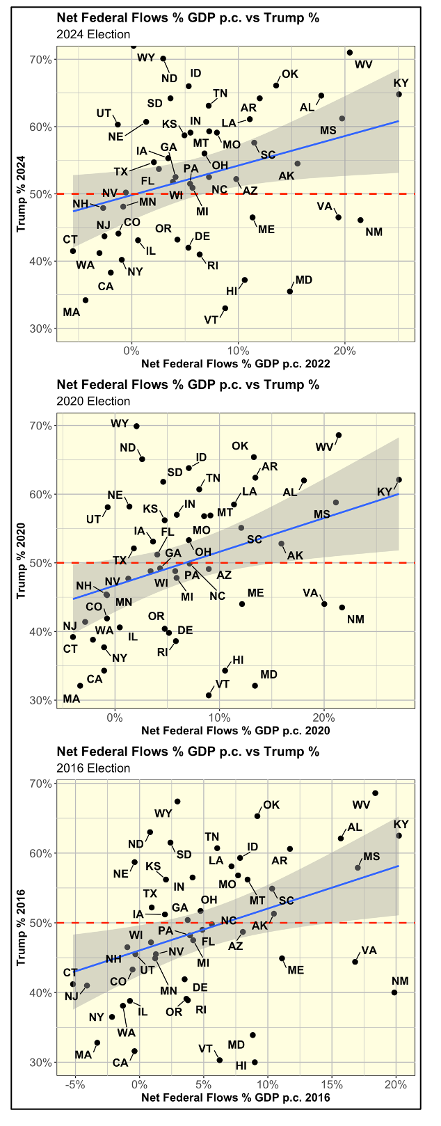
Next, let’s compare it to the previous 2 elections.
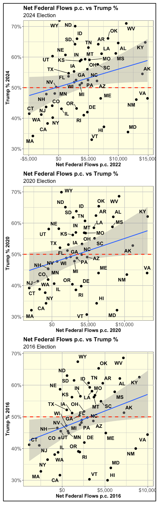
As shown above, the 3 scatter plots look very similar. The main difference is that the 2024 Election is associated with higher Trump % levels. You can see that by focusing on the dashed red horizontal line at the 50% level. The 2024 Election has many more States above that line. The other two Elections do not.
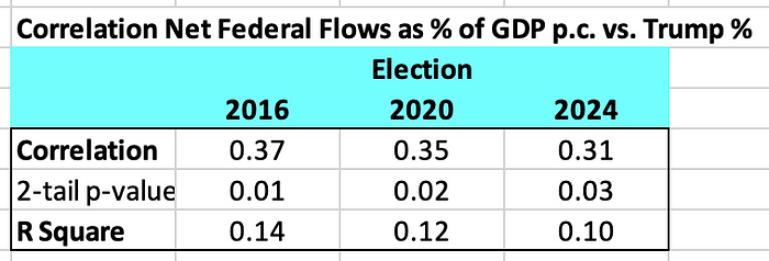
Next, let’s quantify the strength of this relationship for all 3 elections. As shown on the table below, the mentioned relationship is now a lot weaker than when focusing on just the 4 big States.
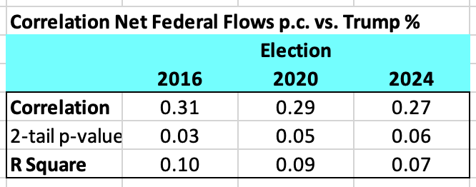
When focusing on just the 4 Big States, the correlation between the two variables was 0.74 and the R Square was 0.55. Now, when looking at all 50 States the correlations have dropped by more than half to around 0.30. And, the R Square is now only around 0.10 or lower.
Thus, when focusing on just the 4 Big States, we appear to readily confirm the hypothesis that the States who benefit more from the Federal Government are the ones who voted for Trump. But, when looking at all 50 States, the confirmation of this hypothesis becomes a lot weaker. It is not directionally wrong as there is still a notable positive relationship between the two; but this relationship is much weaker.
Next, let’s rerun this analysis focusing on Net Federal Flows as a % of GDP per capita vs Trump %.
Analysis of Net Federal Flows as % of GDP per capita vs Trump %
The explanatory narrative for this second analysis would be almost identical than for the first. Thus, I will share the same graphs and tables. but make fewer comments.
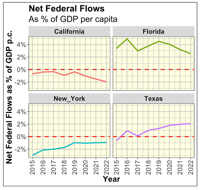
As shown above, the Blue State, California and New York typically pay between 1% and 2% of their respective GDP per capita in Net Federal Flows to the Federal Government. Meanwhile, the Red States, Florida and Texas actually receive a similar amount or more (Florida steadily receives 3% to 4% of its GDP per capita in Net Federal Flows).
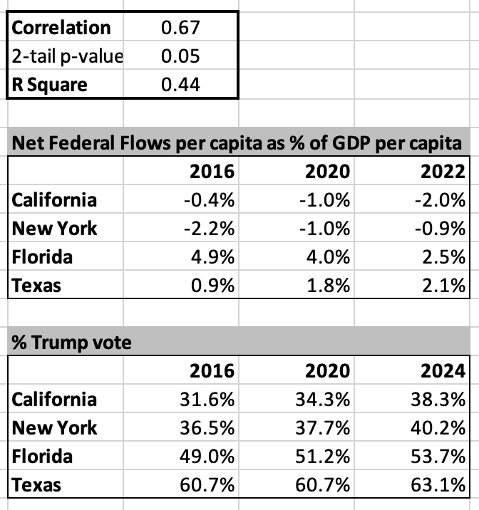
As shown below, correlation and R Square are still very high at 0.67 and 0.44, respectively. These figures are only marginally lower than the 0.74 and 0.55 respective levels from the first analysis.
The scatter plot for the 2024 Election looks very similar to the one in the first analysis.
The 3 scatter plots look similar to the ones in the first analysis.
The correlations and R square levels are close to but a bit higher than the ones in the first analysis.
Conclusion
This analysis tested whether states that benefit most from federal spending are also more likely to support Donald Trump. While that pattern holds strongly for key states like California, New York, Texas, and Florida, the relationship weakens considerably when looking across all 50 states. The broader picture reveals only a modest correlation, suggesting that political allegiance is driven more by cultural and ideological identity than by economic self-interest. Still, the irony remains: many Trump-leaning states rely heavily on federal programs his policies often target for cuts. Recognizing this disconnect is vital — not only for political analysts but also for voters who may be supporting agendas that undermine their own economic foundations.

Gaetan Lion is an independent researcher with expertise in economics, econometrics, investments, risk management, statistics, and quantitative analysis. His areas of interest include demographics, economics, investments, Climate Change, health care, sports, and politics.