
Blog Post < Previous | Next >
Leapfrog
What do [Leapfrog] hospital ratings tell us? Nothing!
Reviewing Leapfrog's hospital ratings
Leapfrog just released their most recent hospital ratings. You can check local hospital ratings at the following link: Leapfrog Hospital Ratings
I checked hospital ratings for 5 hospitals that operate within the San Francisco North Bay area. Three of them are in Marin County. Two of them are in San Francisco. However, the type of analysis I have conducted is easy to replicate; it would work fine for any hospital anywhere in the US. As I uncovered, the Leapfrog hospital ratings actually misinform.
At a high level, I compared Leapfrog’s overall letter ratings for these 5 hospitals with Medicare.gov ratings (converting their 1 to 5-star ratings into letter ratings). I also used Leapfrog’s granular scores in 4 different domains to translate such disaggregated scores into overall letter ratings (I call those my “Calculated” estimates. And, here is what I got.
 Leapfrog gives an overall A rating to all 5 hospitals including Marin Health, Kaiser in San Rafael, Novato, UCSF on Divisadero Street, and UCSF on Parnassus, both in San Francisco.
Medicare.gov gives 5 out of 5-star ratings to 4 out of the 5 hospitals. And, it gives only a 3-star rating for Kaiser. I converted those ratings into As and a C respectively.
Using Leapfrog's underlying data, after deriving my “calculated” estimates, I come up with far more modest ratings in the C range. And, I don’t have enough data (from Leapfrog) to even assess a corresponding rating for either Kaiser or the Novato hospital.
The tables below disclosed what I looked at. I used Leapfrog’s ratings of “Better than average”, “Average”, and “Worse than average” and converted those into respective numbers ranging from 3 for Better, 2 for Average, and 1 for Worse. And, I looked at the 4 main dimensions that Leapfrog used:
- Practice to prevent errors
- Safety problems
- Problems with surgery
- Infections
I color-coded the ratings in a similar way as Leapfrog (green for Better than average, red for Worse than average, and neutral for Average).

Using Leapfrog’s data, it is challenging to comprehend how they could possibly rate all 5 hospitals an overall A. If this was the case, the tables above should pretty much look entirely green for “Better than average”. Instead, there is a lot of white (Average), red (Worse than average), and gray for missing data.
I calculated a more realistic assessment of the quality of each hospital by using the average value for each hospital in each discipline and converting the average to a 100-point scale. For instance, if a hospital had an average of 2.15 in a given discipline, I would convert it into a 100-point score by multiplying that average by 33.333 and get a value of 71.7 which would translate into a C instead of Leapfrog’s consistent “As” across the board.
Two situations are particularly problematic due to missing data.
The first one is Kaiser’s top Leapfrog rating in the “Problems with surgery” discipline. Kaiser did not disclose any data for 4 out of the 7 issues within this category. See below Leapfrog’s related disclosure.


 Within the Problems with Surgery category, Leapfrog gives an overall top letter grade of A to Kaiser, and a top hospital score of 0.000 (best score possible) for simply the hospital not leaving objects within patients after surgery. That’s a pretty low hurdle rate to get an A. Otherwise, Kaiser is Average in two measures. And, it does not submit data in 4 other measures.
The second case of excessive missing data is with the Novato hospital within the “Infections” category where it does not submit data for 4 out of the 6 issues addressed.
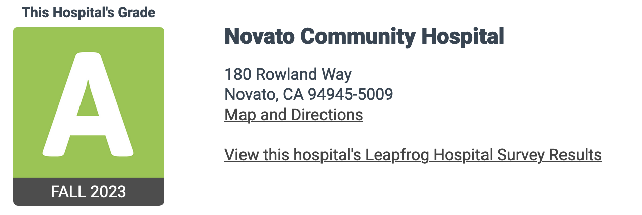

In the above situation, Leapfrog acknowledges it does not have enough data to give a Hospital Score in this one category. But, for Leapfrog, infections are not so important. And, it goes ahead and gives Novato an overall “A.”
There are a few other cases as shown by the gray areas within a table shown earlier. But, the two cases above were by far the most problematic.
Leapfrog Safety Ratings?!
Another issue that raises eyebrows is Leapfrog Safety ratings. Remember Safety is Leapfrog’s main focus as they call their overall ratings “Leapfrog Hospital Safety Grade.”
Below, I just focused on Leapfrog’s own measures of “Better than average”, “Average”, “Worse than average”, and coded them respectively as 3, 2, 1, so I can, in turn, convert those into an average score, a 100 point scale, and ultimately back into a letter grade.

How can any of the above hospitals get an overall A for a rating very much focused on safety?! If it truly was the case, the whole table above should be green. Instead, the majority of the table cells are either white or even red. Some of the safety metrics are especially troublesome.
The UCSF hospitals (Leapfrog disclosure below) are rated “Worse than average” for both Dangerous blood clots and Air bubbles in blood. That’s pretty bad.


Marin Health is rated “Worse than average” for Dangerous blood clot, Collapse lung, and Falls causing broken hips. These are serious matters calling for immediate remediation… not an overall A rating for Safety.


Benchmarking Leapfrog's ratings with Medicare.gov data
Medicare.gov has a ton of information on hospital quality. You can extract that information at the following link: Medicare Hospital Info
The information at Medicare can be overwhelming. So, I focused on a single yet most critical dimension: Death rates for numerous surgeries and conditions. And, here is what I got.

As shown above, I did not find any data for UCSF at Divisadero. Maybe, UCSF’s main hospital is the one at Parnassus.
Again, Kaiser distinguishes itself by not disclosing any data. You have to see it to believe it. See below Medicare.gov disclosure for Kaiser’s death rates.

Novato comes in second place in terms of lack of data disclosure. Contrary to Leapfrog, Medicare.gov at least dings Kaiser for its lack of disclosure by giving it an overall 3 out of 5 stars (corresponding to a “C”). Remember Medicare looks at tons of other stuff besides Death rates.
I calculated the probability that a hospital death rate is lower than the industry exploring 4 different statistical tests. I settled on a fairly standard 2-sample Z-test. This test differentiated a bit more between hospitals than the other tests. On this count, both Marin Health and UCSF performed well with probabilities much greater than 50% that their respective Death rates were much lower than the nationwide industry average. Novato did not score that well. And, it had much missing data.
In view of Medicare.gov data on death rates, I don’t know how Leapfrog could give overall “A” ratings to both the Kaiser hospital and the Novato one. And, it is not like either hospital was that strong in any of the other parameters that Leapfrog focused upon. For Leapfrog, considering Death rates is not important in assessing the overall safety of a hospital.
Qualitative issues with the Leapfrog ratings
Some of the questions asked to assess the quality of error prevention at a hospital are obsolete.
For instance, they ask about “handwashing.” Of course that is critical. But, that has been a well-known fact since the advent of Germ theory in the early 1800s.
Another self-evident criterion is “order drugs with computers.” Hello, networked desktop computers have been around for close to 40 years.
Instead of these outdated criteria, we could use more relevant ones to assess error prevention. Just to think of a few:
- Ensure that the surgical teams get adequate rest before any operations;
- Errors are to be logged and analyzed for root causes to achieve ongoing error reduction;
- Submit data on error rate periodically, so data analysts can evaluate error performance trends over time;
- Protocol to prepare and prevent worst-case scenarios for any critical surgeries;
- Ensure that the supply of blood, plasma, and other critical items is planned for in advance and deemed adequate to optimize surgical success.
The hospital data we need
Using Error Rate as an example, below is the shape of the data we should have on hospital metrics. The metrics should be quantified, tracked over time, and visualized.

In the example above, Leapfrog would tell you that Hospital_A is better than Hospital_B because it has a lower current Error Rate. However, when you look at the long-term trend, it becomes clear that Hospital_B is far better as it is on a consistent path of perpetual improvement. Meanwhile, Hospital_A has a highly volatile record with no improvement whatsoever.
The above table and graph for a single metric should be part of a complete dashboard covering numerous key metrics. We routinely do this kind of data disclosure for money (Bloomberg terminals, Yahoo Finance, etc.) why not for saving lives.